I love working with jazz musicians. Maybe it’s the way they’re wired — pre-disposed to experimentation, risk-taking and collaboration. Most musicians I’ve worked with tend to be that way as well, but the jazz guys are always open to out-of-the-box thinking. And, maybe, it’s that I’ve been especially happy with the jazz covers I’ve designed through the process.
Steve Olson is a Baltimore-area drummer and producer who reached out to me, as a fan of the Raising Sand artwork from the 2008 Robert Plant and Alison Krauss record. We’ve done two records together, and Steve has sent several other jazz musicians my way. Here’s the backstory on Steve’s two records, Conversations and The Ruthless Shapes of Paradise.

I did not know of Steve’s work, but he explained to me “the concept behind Conversations was intimate, one-on-one duos with other musicians.” His notes, included in the CD packaging, referenced “conversations, dialogue, and aural paintings.”
We looked at a lot of images, from a variety of styles and subject matter, and kept coming back to the cafe table and chairs. I believe Steve found it.
Below left is the original color version he presented me. I recently asked him what the image said to him. He responded:
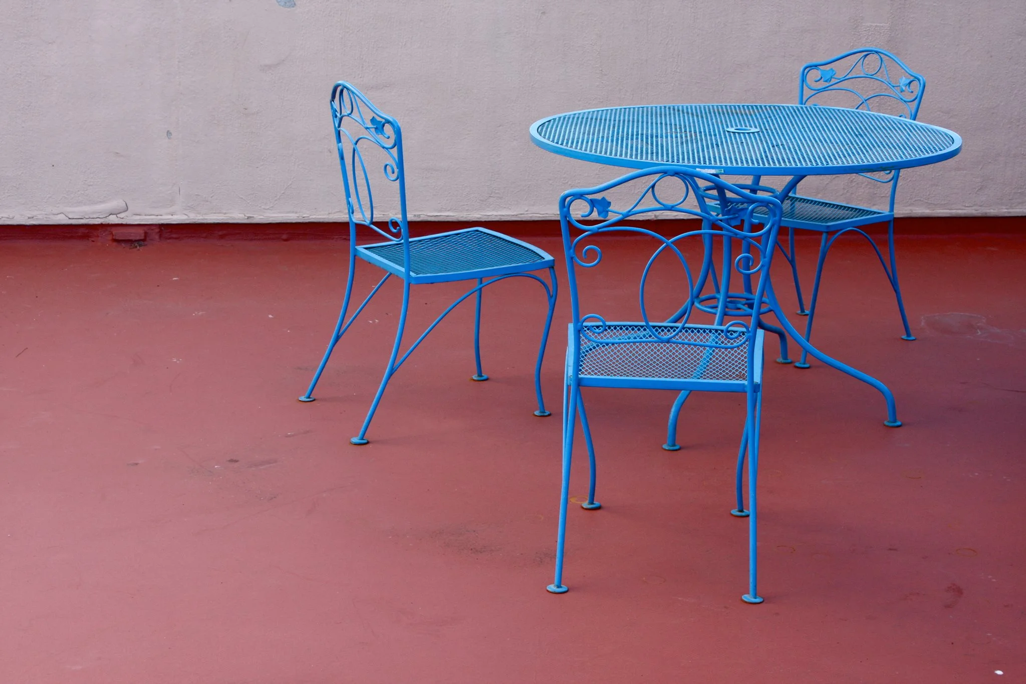
“To me, the close surroundings, and the chairs and table, imply that a very personal communication between two people either just occurred, or is about to. Or from the listener’s perspective, they are about to have that conversation with the musicians, or eavesdrop on one.”
I definitely concurred that this image addressed all of those things. I LOVED the colors in the original, but felt it wasn’t quite right. I thought maybe the colors were too strong and wanted to simplify it, to zero in on just the image itself, so I drained all of the color and pushed the contrast to make it even more monochromatic. Now, it spoke to me.
I also cropped the shot to two chairs, instead of the three, with one of those two also cropped out of the photo, and putting more focus on the one with its “back” to the viewer. This, combined with the starkness, gave the composition a bit of mystery… an edge. It felt like “unfinished” business to me. Did we interrupt something, rather than simply eavesdrop? Like great music or lyrics, I find things much more interesting where there are multiple possibilities, leaving that final assumption to the viewer/listener. Finally, I used very simple and strong type so that emphasis is left focused on the table and chairs.

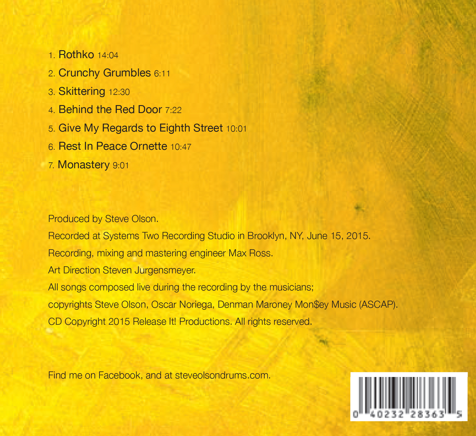
We next worked together on, The Ruthless Shapes of Paradise, a trio featuring Steve accompanied by Denman Maroney on “hyperpiano," and Oscar Noriega on alto saxophone and bass clarinet.
Steve is a huge fan of Mark Rothko, and had hopes of licensing one of his pieces of art for this project, but that proved economically challenging. What was it, I wondered, about Rothko’s art that attracted the drummer, and why was that a starting point for this project visually?
Olson explains: “I’ve loved Rothko’s work since I first saw it decades ago, long before I was a musician. Much of this recording was inspired by the music, and esthetic, of composer Morton Feldman, who was a close friend of Rothko’s. Their art was intertwined in the 1940s and ‘50s. So I knew right away that I wanted a Rothko-esque visual to go along with the Feldman-esque music.”
Luckily, I found a wealth of Rothko-inspired artwork that did fit our budget. I focused on the word “Ruthless” in the title; that word, to me, was very angry…very hot. Following that lead, I weeded out any works that had muted colors or earth tones. I also focused on pieces that were more shapeless, with space and breathing room, than Rothko’s more grid-oriented work.
I adjusted and pushed the colors to create a palette I felt represented all of the above, and utilized a single piece of art for the additional panels, changing only the color. I again utilized a simple typeface, less as conscious branding, but rather as a nod to the simplicity and effectiveness as those classic Blue Note and, especially ECM, covers.
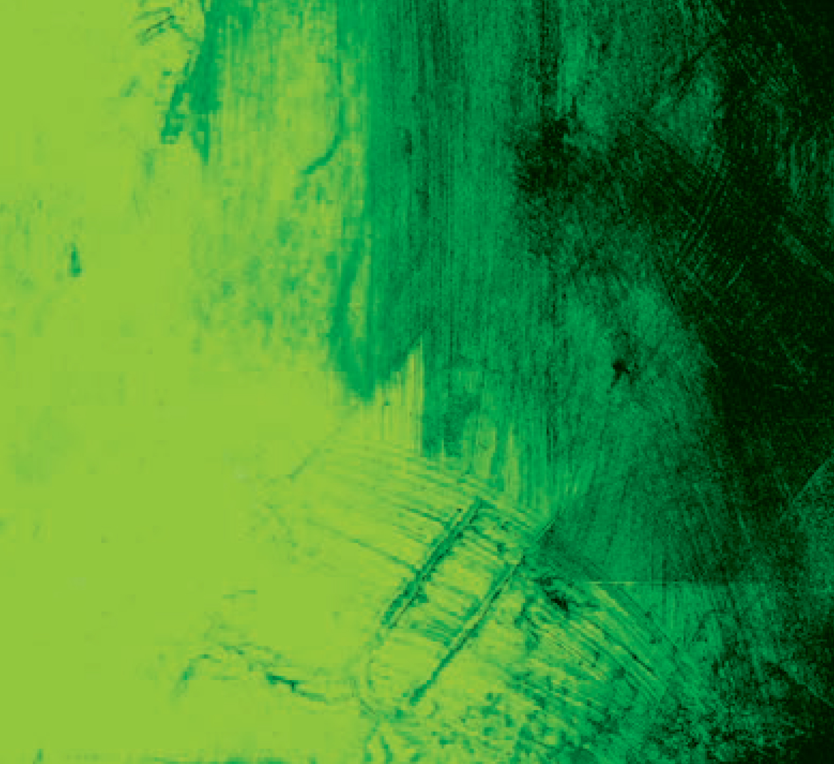

So. Did we find Rothko, space, art, and music?
“Very much so. The cover depicts openness, possibility, yet also purpose and possible directions. Exactly the same as the music,” concludes Olson.
Now…about that title…
“I stole the phrase from a biography of composer Morton Feldman. The writer used it to describe Feldman’s music. I just loved the turn of phrase, and thought it nicely described both the joy and pain of creating art.”
Jazz cats…they’re a special breed.