BRANFORD MARSALIS QUARTET ”Four MF's Playin' Tunes“

After Songs of Mirth and Melancholy, his gorgeous duet album with Joey Calderazzo, Branford Marsalis returned to his quartet for the next record, Four MF’s Playin’ Tunes. It was the first Branford Marsalis Quartet project since 2009 and featured newly enlisted drummer Justin Faulkner, and Marsalis was very excited about this version of the band. That, in fact, was the basis of his visual direction to me: this band was hot, they played extremely well off of each other, and each player was an integral piece. And, with that, I was off…

I came up with a concept that was easy to explain, but understood that it might be hard to visualize, since the whole hook played off the camera’s shutter speed. The idea was to feature each member, starting with Branford, seated in a simple chair against a white seamless backdrop. Then, behind him, the other three band members would hustle in and out, constantly walking and moving behind Branford. The photographer, Eric Ryan Anderson, would then focus on Marsalis, sitting extremely still, and utilize a very slow shutter speed so everyone else would be a blur. I thought this perfectly represented Branford’s idea of this band.

To fully illustrate that each person, at some point, stood at the center of the music, we had each member take his turn “in the chair,” while the former subject joined in the blur of energy in the background. It was awesome, simultaneously one of the most fun —  and most stressful — shoots I’ve ever worked on. The very nature of the concept was random; you simply couldn’t tell what you were going to get, but thank goodness for the digital age. Laptops gave us real-time updates where we could make adjustments instantly; this would have been a nightmare, if not impossible, with film. Eric Ryan Anderson was brilliant, and the band was tireless in our pursuit of what we were looking to execute.

Knowing we had achieved what we wanted, we celebrated and called it a day. We took a TON of pictures, and although many weeded themselves out for various reasons — people had walked out of the frame, the subject at the center had moved and was also blurry — we had lot to choose from, and everyone found a shot of themselves they liked. For once, we did not have to find a single photo of four people, where all four people were happy with how they looked!

As I laid out a series of approved photographs, I had an idea on how to further the metaphor of Branford’s vision of the band. Since they were ALL integral to the band, why not make a booklet where you could fold it in a way that each band member could be on the cover? By reproducing the title of the record on each panel, this could be easily accomplished — and, boy, did the rhythm section love this concept! Although the record did not yet have a title, I mocked it up with some dummy type and worked with our printer to get a fold that could accommodate this concept. It was very cool — perfect “conceptual continuity” to quote the late, great Frank Zappa.

Now…about that title. The shoot was over, the design work nearly finished, but there was still no title for the record. There was a conference call with Branford, his management/label reps, and myself and, after much discussion, Branford was exasperated and said “I don’t care what you call it. Call it four motherfuckers playing tunes.” The call ended shortly after that, but I could not get that potential title out of my head. It fit *perfectly* and after some discussion, a censored version got the official go ahead.

There was still one more piece to complete; the tray card. That piece can fill up quickly, with the tracks and times featured, and the necessary evils of logos, legal lines and the UPC shoehorned in. It simply doesn’t leave much room for graphics, particularly if you’re looking at a full band shot. Combing through the photos, I was struck by a singular image, likely a throwaway shot simply to check lighting and framing. It was the lone chair that quietly shared the stage with the quartet, in stark light against the seamless background fabric. Not only did it offer lots of negative space to accommodate all of the type, it presented a beautiful idea to me. After the shoot was over, it was the last thing standing, and for my concept of the revolving group energy around each musician, it offered up the metaphor of being the musical document left behind from the band, their recording sessions, and the photo shoot.

I’ve recently come across Yo Yo Ma’s latest release “Six Revolutions: Bach Cello Suites and did a double, triple and quadruple take. I thought, “That’s my cover for ‘Four MF’s! Right down to the simple chair!” I put a lot of conceptual thought into this project and can’t help but wonder what the thought process was behind the Ma cover. They say imitation is the sincerest form of flattery, but, man…I can only hope it’s an homage of some sort and not just co-opting the concepts and ideas I brought to bear for the “Four MF’s…” project. Damn!

STEVE OLSON “Conversations” and “The Ruthless Shapes of Paradise”

I love working with jazz musicians. Maybe it’s the way they’re wired — pre-disposed to experimentation, risk-taking and collaboration. Most musicians I’ve worked with tend to be that way as well, but the jazz guys are always open to out-of-the-box thinking. And, maybe, it’s that I’ve been especially happy with the jazz covers I’ve designed through the process.

Steve Olson is a Baltimore-area drummer and producer who reached out to me, as a fan of the Raising Sand artwork from the 2008 Robert Plant and Alison Krauss record. We’ve done two records together, and Steve has sent several other jazz musicians my way. Here’s the backstory on Steve’s two records, Conversations and The Ruthless Shapes of Paradise.

I did not know of Steve’s work, but he explained to me “the concept behind Conversations was intimate, one-on-one duos with other musicians.” His notes, included in the CD packaging, referenced “conversations, dialogue, and aural paintings.”

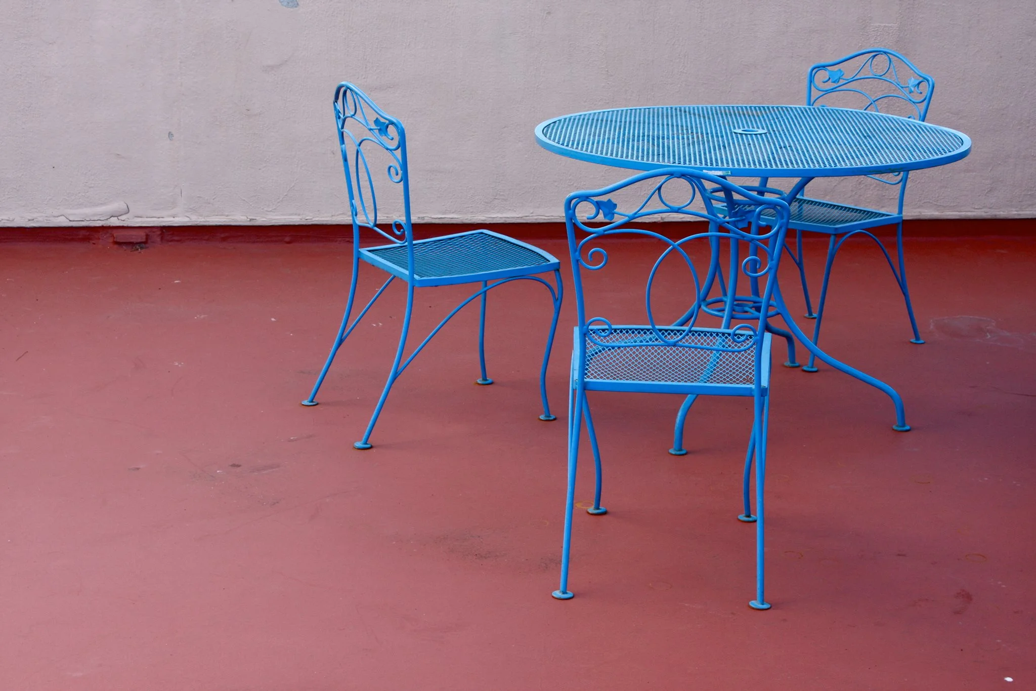
We looked at a lot of images, from a variety of styles and subject matter, and kept coming back to the cafe table and chairs. I believe Steve found it.

Below left is the original color version he presented me. I recently asked him what the image said to him. He responded:

26220546_10213158605032394_1272168763540515167_o.jpg

“To me, the close surroundings, and the chairs and table, imply that a very personal communication between two people either just occurred, or is about to. Or from the listener’s perspective, they are about to have that conversation with the musicians, or eavesdrop on one.”

I definitely concurred that this image addressed all of those things. I LOVED the colors in the original, but felt it wasn’t quite right. I thought maybe the colors were too strong and wanted to simplify it, to zero in on just the image itself, so I drained all of the color and pushed the contrast to make it even more monochromatic. Now, it spoke to me. 

I also cropped the shot to two chairs, instead of the three, with one of those two also cropped out of the photo, and putting more focus on the one with its “back” to the viewer. This, combined with the starkness, gave the composition a bit of mystery… an edge. It felt like “unfinished” business to me. Did we interrupt something, rather than simply eavesdrop? Like great music or lyrics, I find things much more interesting where there are multiple possibilities, leaving that final assumption to the viewer/listener. Finally, I used very simple and strong type so that emphasis is left focused on the table and chairs.

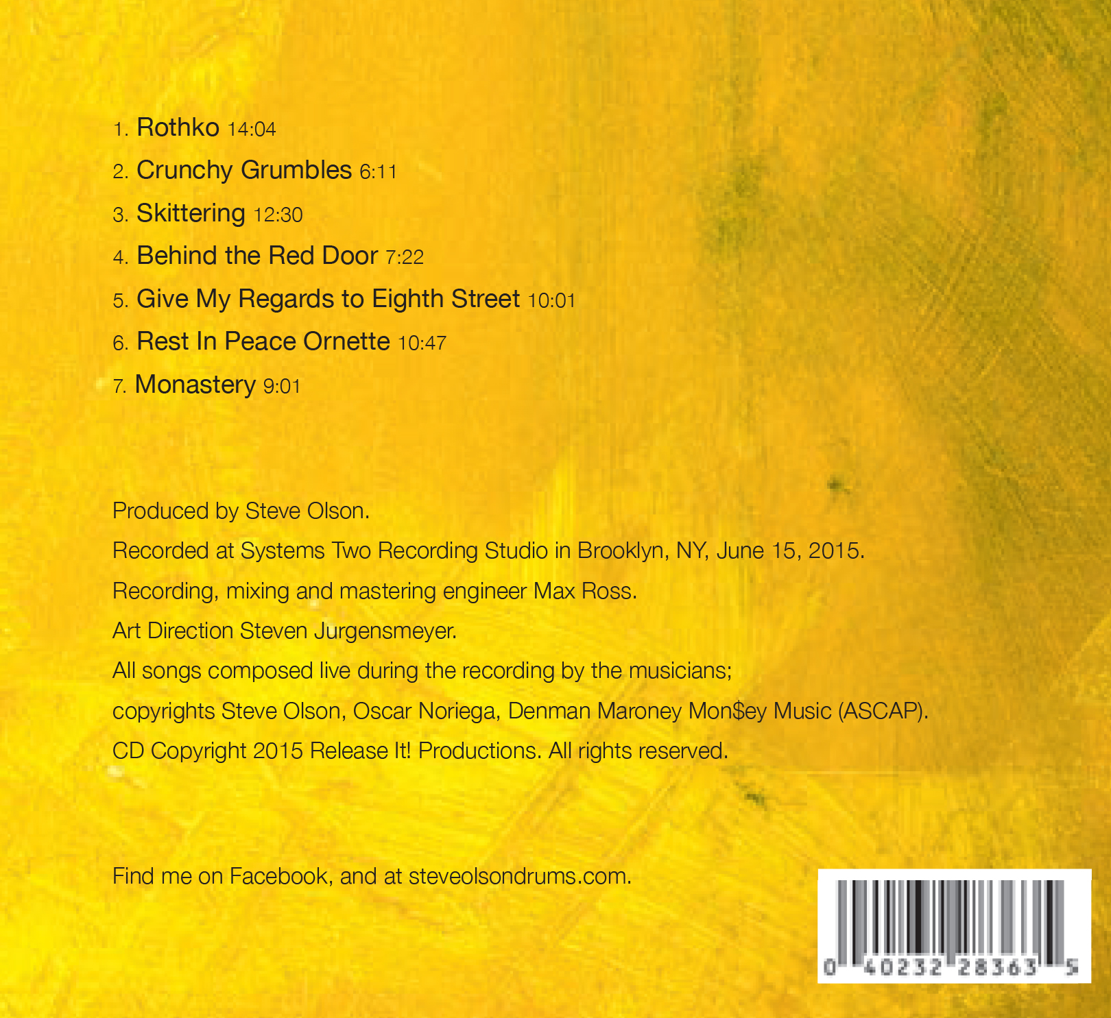
We next worked together on, The Ruthless Shapes of Paradise, a trio featuring Steve accompanied by Denman Maroney on “hyperpiano," and Oscar Noriega on alto saxophone and bass clarinet.

Steve is a huge fan of Mark Rothko, and had hopes of licensing one of his pieces of art for this project, but that proved economically challenging. What was it, I wondered, about Rothko’s art that attracted the drummer, and why was that a starting point for this project visually? 

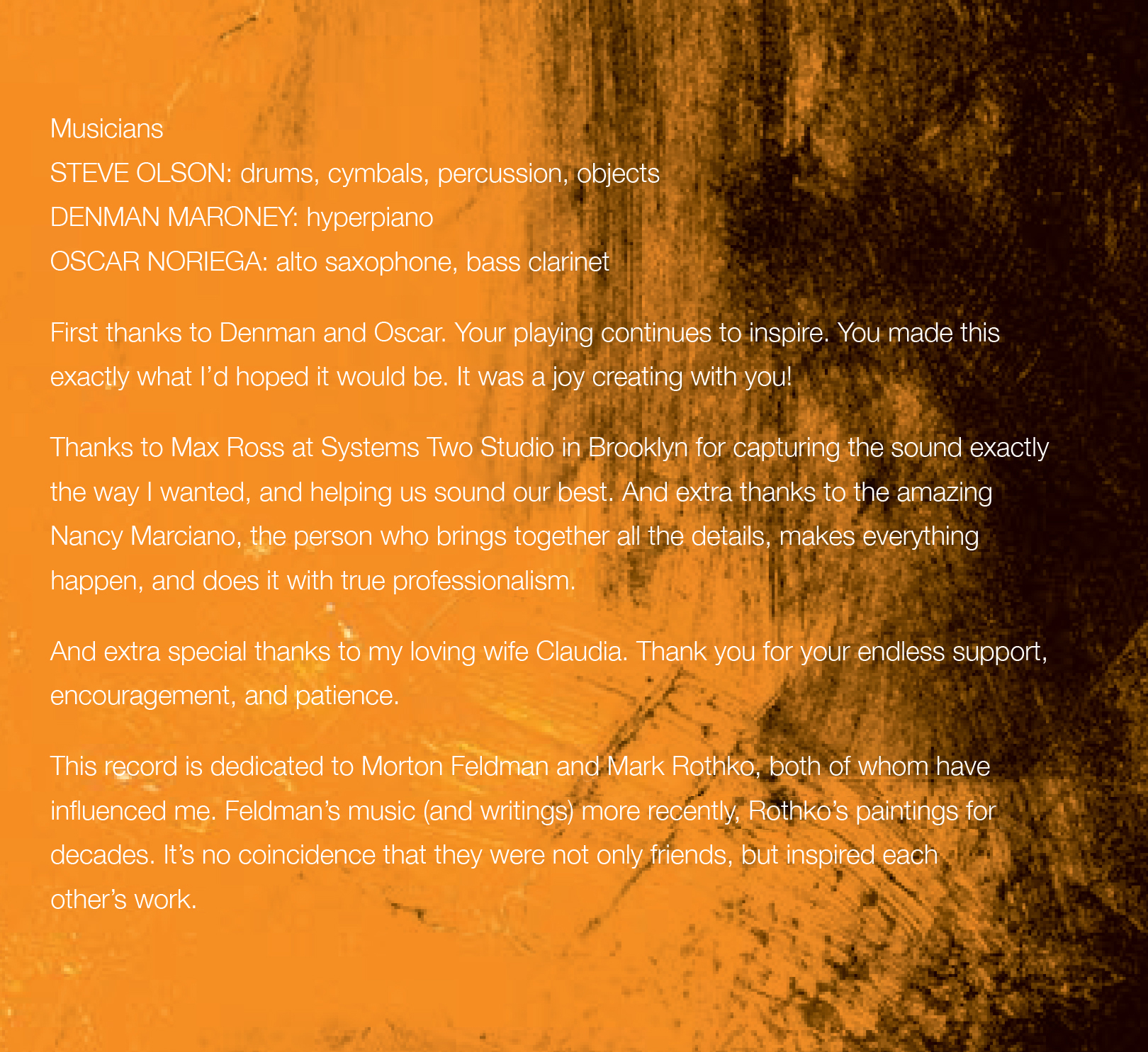
Olson explains: “I’ve loved Rothko’s work since I first saw it decades ago, long before I was a musician. Much of this recording was inspired by the music, and esthetic, of composer Morton Feldman, who was a close friend of Rothko’s. Their art was intertwined in the 1940s and ‘50s. So I knew right away that I wanted a Rothko-esque visual to go along with the Feldman-esque music.”

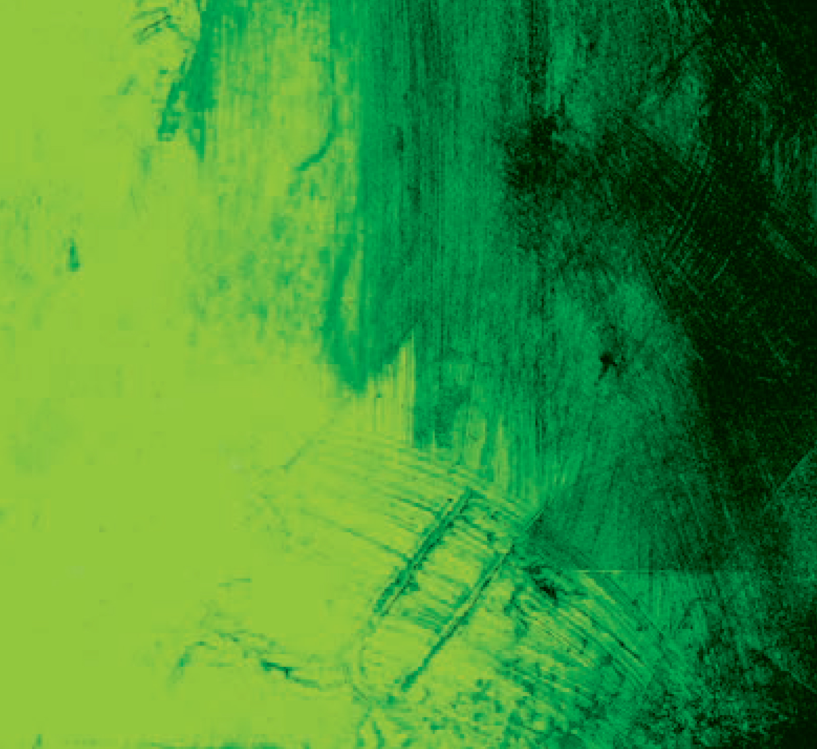
Luckily, I found a wealth of Rothko-inspired artwork that did fit our budget. I focused on the word “Ruthless” in the title; that word, to me, was very angry…very hot. Following that lead, I weeded out any works that had muted colors or earth tones. I also focused on pieces that were more shapeless, with space and breathing room, than Rothko’s more grid-oriented work.

I adjusted and pushed the colors to create a palette I felt represented all of the above, and utilized a single piece of art for the additional panels, changing only the color. I again utilized a simple typeface, less as conscious branding, but rather as a nod to the simplicity and effectiveness as those classic Blue Note and, especially ECM, covers.

So. Did we find Rothko, space, art, and music?

“Very much so. The cover depicts openness, possibility, yet also purpose and possible directions. Exactly the same as the music,” concludes Olson.

Now…about that title…

“I stole the phrase from a biography of composer Morton Feldman. The writer used it to describe Feldman’s music. I just loved the turn of phrase, and thought it nicely described both the joy and pain of creating art.”

Jazz cats…they’re a special breed.

BRANFORD MARSALIS/JOEY CALDERAZZO "Songs of Mirth and Melancholy"

Branford Marsalis has always provided his music to me in advance and asked me to "design what you hear." Believe me, those words are an art director's dream; that level of trust is really hard to find. But it also places an enormous responsibility on your shoulders; you really want to make sure you get it right.

This project was a collaboration with longtime Marsalis pianist Joey Calderazzo and presented a unique challenge; to my ears, the music was incredibly "open" and sparse, with lots of space around the two instruments. At the same time, there was a very obvious familiarity between the two musicians, and that closeness also informed the music. I was intent on somehow capturing and conveying these two disparate concepts on the cover.

CD/LP Back Cover Photo

I knew the focus, or part of it at least, would be on Branford and Joey. I came up with the idea of using scale to represent the openness of the music; the familiarity aspect would have to be provided by the two musicians.  I mocked up some very detailed computer sketches for Branford to help visualize and explain my concept using stock art and models.

With a preliminary green light, I started looking for locations with high ceilings and a unique, ambient vibe, as I did not want the musicians to be overwhelmed by their surroundings. I found a warehouse space in South Boston for the shoot, and it was perfect; a giant, empty space with concrete floors and a huge brick wall painted white. I knew the musicians would just pop right out of that background. Unfortunately, that plan fell apart at the last minute.

I discovered that the photographer for the shoot, Boston-based Stephen Sheffield, had a connection to the Museum of Fine Arts in Boston. The museum had just recently opened the new Art of the Americas wing, which featured a beautiful, massive granite wall. We negotiated to do the shoot on a Monday holiday. However, a holiday meant more visitors and we had to start the shoot at 6 a.m. to be finished when the museum opened to the public at 9 a.m. Working musicians seldom like a call time that early, but we were running up against a tour, so Branford and Joey, knowing our time constraints, were game. The space was lit by skylights, which meant we did not need to set up any additional lighting and could move quickly.

Obviously, an outtake.

Sheffield and I started marking off spots on the floor for the musicians to stand and began framing the shot. Sadly (predictably?), my tight script just wasn't working; I had pictured the musicians at either corner of the frame, walking either toward or away from each other. Unfortunately, it lacked the energy I was seeking and looked "too" staged. Thank goodness for digital cameras tethered to laptops so you can see the shoot in real time!

Meanwhile, Branford and Joey started goofing around and cracking jokes. Sheffield was ready and snapped the singular shot that became the cover There were no others like it because Joey had just said something that made Branford laugh. If you look closely, Branford is covering his mouth and Joey is looking off to the side so that he, also, wouldn't start cracking up. ONE shot. And there you have it...that "thing" we were missing; that "thing" that gave a human connection to the scale and space concept. The poster really accentuated the spatial concept, due to not being constrained to a square format.

By the way, Branford was also more than capable of being a cutup, and both the musicians kept the shoot quite loose as Sheffield and I fine-tuned ideas on the fly. See the outtake above left. In retrospect, I think Branford and Joey's personalities were key to the success of the shoot, and the body language on the back cover illustrates those split-second moments that work.

Poster

I have always looked to some of the classic Blue Note covers for inspiration. Reid Miles and Francis Wolffe really changed album cover design with their interesting use of size, scale, perspective and, of course, their simple yet beautiful typography. This was my guide — and goal — for this album cover, and  "Songs of Mirth and Melancholy" remains one of my favorite covers I've worked on.