Words. Then pictures…

I’ve long been fascinated with album covers that rely heavily on typography to get their point across. Sometimes, it’s necessity; perhaps “good” photos aren’t available or they are simply more appropriate for texture and ambience. Perhaps it is a compilation or historical record where relevant photography just isn’t available. While the following covers do feature imagery, it is decidedly secondary — or, at least, secondary to the type treatment.

“WHEN RHYTHM WAS KING” Various Artists

This is another of my favorite covers. As I’ve mentioned elsewhere on the site, the Heartbeat re-branding project leaned heavily on the packaging.

I loved the title that Chris Wilson and Josh Blood had come up with — “When Rhythm Was King” — and felt it set the tone for the project.  I had some interesting period-specific shots of a Jamaican dancehall to use, but something was missing. I started editing down some of the marketing/press copy that usually goes on the back of a compilation and put it front and center on the cover. That did the trick; suddenly, it was ALL attitude: “Collectors Beware,” “Put it on, you can’t take it off,” “Serious Thing,” and “Damn right. Studio One,” and that was just on the front cover. An aggressive and strong type treatment and a mezzotint on the vintage photographs within, completed the package. We didn’t have a lot to use, but boy, did it all hang together now — a simple but strong concept. And, of course, the music inside is up to the task. Pure Jamaican rhythms. Since Heartbeart Records is apparently no longer with us, this is one to search out. You won’t be disappointed.

DEVO “Live: The Mongoloid Years”

To be honest, this is a project that I really, really, really wanted to do a die cut for. The type would be cut out of the cover slipcase, and the photo — originally a black and white — would slide in to reveal what you see here. Unfortunately, die cuts were rather expensive back in the day so I had to improvise. This comes damn close, with the title highly readable, and the imagery taking you a minute to process. Remember those amazing days when you could actually get this close to a performer? I thought the design was pretty effective overall, and did actually look like a die cut.

Ah, budgets…the mother of creativity! Who knew..?


JAMES HAND “The Truth Will Set You Free”

I recall this photo being an early favorite of mine for the cover, and perhaps James’ as well. However, it did not really lend itself to the simple Name/Title format. The negative space, usually an asset in my eyes, proved formidable. Often, the type treatments simply got lost here. Once again, I turned to the press release that had been circulated about this release, and edited out some of my favorite bits to make a short narrative that ended with the title. It reads:

Somewhere in Texas, a haunting voice reverberates
Off saloon walls, a voice rich with the echoes of
Timeless Country music
The singer & the songwriter is James Hand
And he has a story to tell
Listen once and “The Truth Will Set You Free!”

ROBERT PLANT | ALISON KRAUSS ”Raising Sand“

There was talk around the Rounder offices that Alison Krauss, the label’s biggest artist, was in the studio with legendary roots producer T-Bone Burnett. But the more interesting whisperings were that Robert Plant was involved in the project; that information was hard, if not impossible, to get confirmed. Still…the guess was a duets album. That made sense.

Raising Sand was, of course, the result of those sessions and the record would go on to win five Grammy Awards. It is an entirely unique collaboration and one I’m proud to have worked on as art director. The packaging, particularly the album cover that would perfectly capture the music and spirt of the record, was an interesting journey. There was some talk of hiring a freelancer for the packaging, and if Robert had really insisted, it likely would have gone that way. But I had a history of working with Alison and Union Station (Live, Lonely Runs Both Ways) and I vocally lobbied for myself! Moreover, I also had a connection to Robert’s manager, as she was a former employee at Rykodisc/Rykodisc Europe, where I also had worked for many years.

Alison’s longtime manager reached out to LA-based photographer Pamela Springsteen about the project. “I had never had the opportunity to photograph Robert before but I had worked with Alison,” explains Springsteen. “The first time I photographed Alison was with her band Union Station. It was for the album New Favorite, which was released in 2001. My assistant David and I flew out to Nashville for the shoot, and we spent a couple days location scouting and found an old diner called Elliston Place that let us shoot there at night after closing. The image used for the cover of the album was a shot of Alison and the band hanging out at the counter drinking coffee and eating pie. The album won the Grammy for Best Bluegrass Album in 2002.”

Robert was definitely involved in the look and direction of the album, but as Pamela recounts, “What I remember most was being asked if I could go down and meet Robert at his hotel in Santa Monica to discuss the shoot and the direction. I drove down there not knowing much about the project but very excited to be part of it. Robert came to the door and was really warm and friendly which immediately put me at ease. We talked for a couple hours and he shared his concerns about how to make what seemed like an unlikely collaboration work visually. Then he played some of the music for me which was absolutely incredible. It was a great afternoon and being a fan of Led Zeppelin and Robert Plant since I was a teenager, I couldn’t believe this was actually my job.” She’s not the only one. I vividly remember a conference call following the shoot, with Robert, Alison and Pamela and me, and thinking “damn…this is a pretty good day at work.” 

As this was still very much a secretive project, there wasn’t much internal discussion about creative direction. I’m certain the powers that be figured Robert Plant would know how he — and Alison — might want this unique project visually represented. Pamela’s recollection backs that up: “I don’t believe they had the title for the album chosen yet. We decided we wanted to keep the shoot simple and relaxed. I had a friend, Peter Philbin, who had been in the music business for years signing many successful bands to Columbia Records and he owned a house on the beach right below Robert’s hotel. I knew they would be comfortable there. We rented Peter’s beach house for the day, set up a studio in the large living room and used various locations throughout the old Spanish home. Robert initially wanted the focus to be more on Alison and said he would show up for a few shots. The day of the shoot he arrived early and I shot singles of him first while Alison was getting ready. He was immediately comfortable in front of the camera and I knew we were going to have a great day. When Alison arrived on set they had great chemistry and had such a good time together. Shooting in a relaxed environment worked really well; Robert ended up staying the whole day with us. His mischievous, playful manner brought a lightness to the shoot and he and Alison played off each other so well.”

There were a couple of shots being considered for the cover shot, but one seemed to gain traction, particularly within the Plant camp. I think everything I saw was black and white. “I always loved shooting in black and white,” Springsteen recently told me. “And in those days I was still mainly shooting film. I usually shot about 50% black and white and 50% color on my jobs. The last shot of the day was going to be on the beach when the light was at its best. The day went fast and the sun was setting. I didn’t want to create an elaborate lighting set up and lose the intimacy between them so I pulled out my high speed black and white film and captured those shots using only natural light. It was cold and we were losing light quickly so I had to shoot fast. We captured the cover in probably less than 15 minutes. It just worked.”

One of the things the shoot clearly captured was the connection between Robert and Alison. They seem so comfortable and at ease with each other. Again, Pamela: “The vibe between Robert and Alison was great, they had a lot of fun together. They are both witty and have a great sense of humor, but what also stood out was the huge amount respect they had for each other. It was a pleasure to be around, and the chemistry between them was a photographer’s dream. They played off each other incredibly well and they were very generous with each other throughout the whole shoot.”

I particularly loved the image we selected for the back cover with Alison beaming and Robert with his back to the camera. It just says so much. I asked Pamela if she instantly knew what she had captured there: “Yes, that was a perfect moment,” she told me. “They were so in sync with their steps and body language, the way he is leaning into her as she turns to look back, I’m certain he was probably telling her something to make her laugh. There was such a sweetness between them.”

Working with great photographers always makes an art director’s job easier. But, of course, there are always issues somewhere in the process. At one point, Robert asked for some minor retouching on his jeans. “It looks like I have a pocketful of conkers!” he told me. I assured him we could get rid of that, although I had no idea what the hell conkers were! I threw it out to some friends, and one who had spent some time at English prep school told me it was slang for marbles! Ah…Ok. Got it. Done!

More critically, there was some dissatisfaction within the label with the graininess of the photograph. Many, myself included, felt it only added to the mood of the image, but we did jump through a few hoops trying to get rid of it. Thankfully, after many attempts, everyone agreed that removing the grain looked wrong. Antiseptic. Just. Plain. Bad.

The horizon line to the left of Robert and Alison provided an obvious place and break for some very simple typography, and kept the emphasis on the two stars. I digitally extended the beach to run across the inside three panels, and a matte finish reinforced the low key vibe of the record. And there it was…

I’ll let Pamela take it from here… ”It was such an honor to work with these two greats and to be part of this fantastic album. The album won a Grammy in every category it was nominated for including “Album Of The Year” on February 8th, 2009 (which also happened to be my birthday!)”

I could not have said it better. It was simply a pleasure to work on beautiful, one-of-a-kind record with some incredibly talented people.

STEVE OLSON “Conversations” and “The Ruthless Shapes of Paradise”

I love working with jazz musicians. Maybe it’s the way they’re wired — pre-disposed to experimentation, risk-taking and collaboration. Most musicians I’ve worked with tend to be that way as well, but the jazz guys are always open to out-of-the-box thinking. And, maybe, it’s that I’ve been especially happy with the jazz covers I’ve designed through the process.

Steve Olson is a Baltimore-area drummer and producer who reached out to me, as a fan of the Raising Sand artwork from the 2008 Robert Plant and Alison Krauss record. We’ve done two records together, and Steve has sent several other jazz musicians my way. Here’s the backstory on Steve’s two records, Conversations and The Ruthless Shapes of Paradise.

I did not know of Steve’s work, but he explained to me “the concept behind Conversations was intimate, one-on-one duos with other musicians.” His notes, included in the CD packaging, referenced “conversations, dialogue, and aural paintings.”

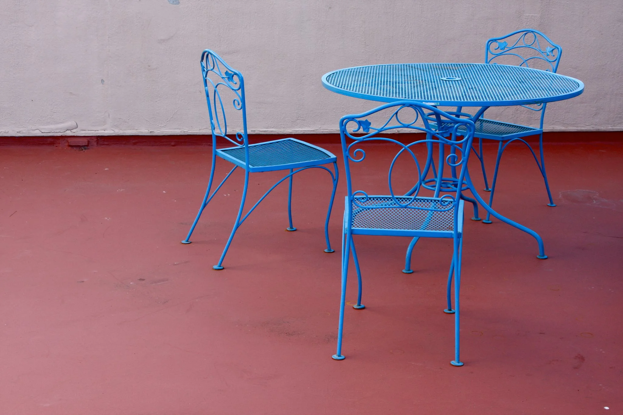
We looked at a lot of images, from a variety of styles and subject matter, and kept coming back to the cafe table and chairs. I believe Steve found it.

Below left is the original color version he presented me. I recently asked him what the image said to him. He responded:

26220546_10213158605032394_1272168763540515167_o.jpg

“To me, the close surroundings, and the chairs and table, imply that a very personal communication between two people either just occurred, or is about to. Or from the listener’s perspective, they are about to have that conversation with the musicians, or eavesdrop on one.”

I definitely concurred that this image addressed all of those things. I LOVED the colors in the original, but felt it wasn’t quite right. I thought maybe the colors were too strong and wanted to simplify it, to zero in on just the image itself, so I drained all of the color and pushed the contrast to make it even more monochromatic. Now, it spoke to me. 

I also cropped the shot to two chairs, instead of the three, with one of those two also cropped out of the photo, and putting more focus on the one with its “back” to the viewer. This, combined with the starkness, gave the composition a bit of mystery… an edge. It felt like “unfinished” business to me. Did we interrupt something, rather than simply eavesdrop? Like great music or lyrics, I find things much more interesting where there are multiple possibilities, leaving that final assumption to the viewer/listener. Finally, I used very simple and strong type so that emphasis is left focused on the table and chairs.

We next worked together on, The Ruthless Shapes of Paradise, a trio featuring Steve accompanied by Denman Maroney on “hyperpiano," and Oscar Noriega on alto saxophone and bass clarinet.

Steve is a huge fan of Mark Rothko, and had hopes of licensing one of his pieces of art for this project, but that proved economically challenging. What was it, I wondered, about Rothko’s art that attracted the drummer, and why was that a starting point for this project visually? 

Olson explains: “I’ve loved Rothko’s work since I first saw it decades ago, long before I was a musician. Much of this recording was inspired by the music, and esthetic, of composer Morton Feldman, who was a close friend of Rothko’s. Their art was intertwined in the 1940s and ‘50s. So I knew right away that I wanted a Rothko-esque visual to go along with the Feldman-esque music.”

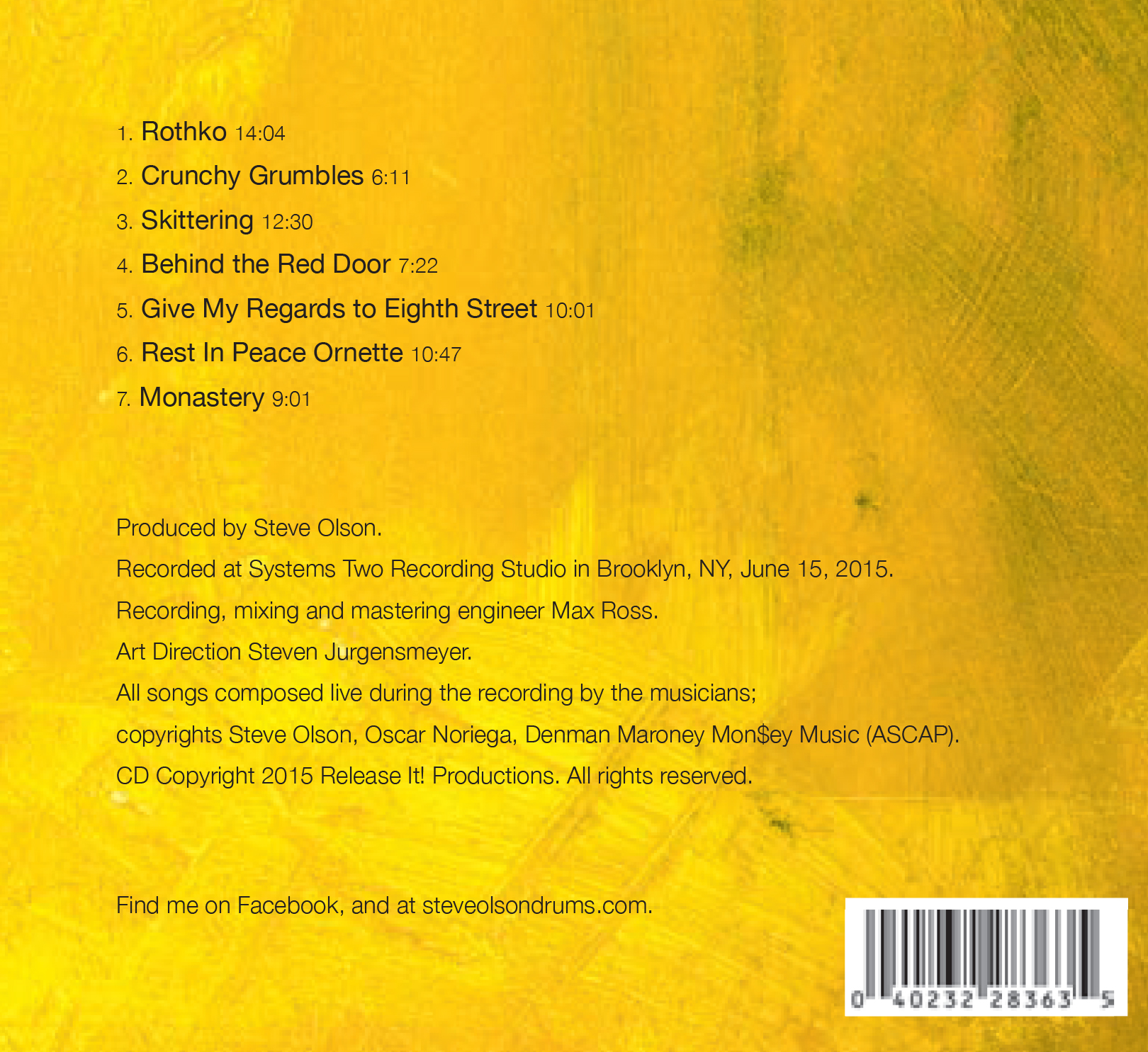
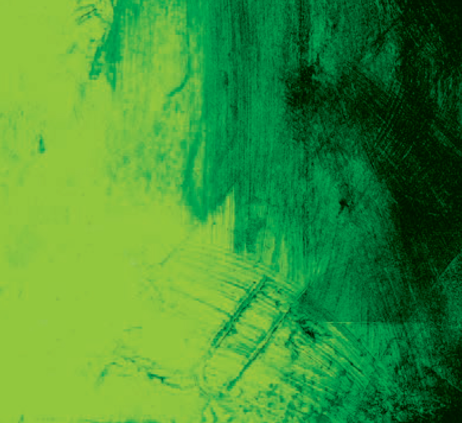
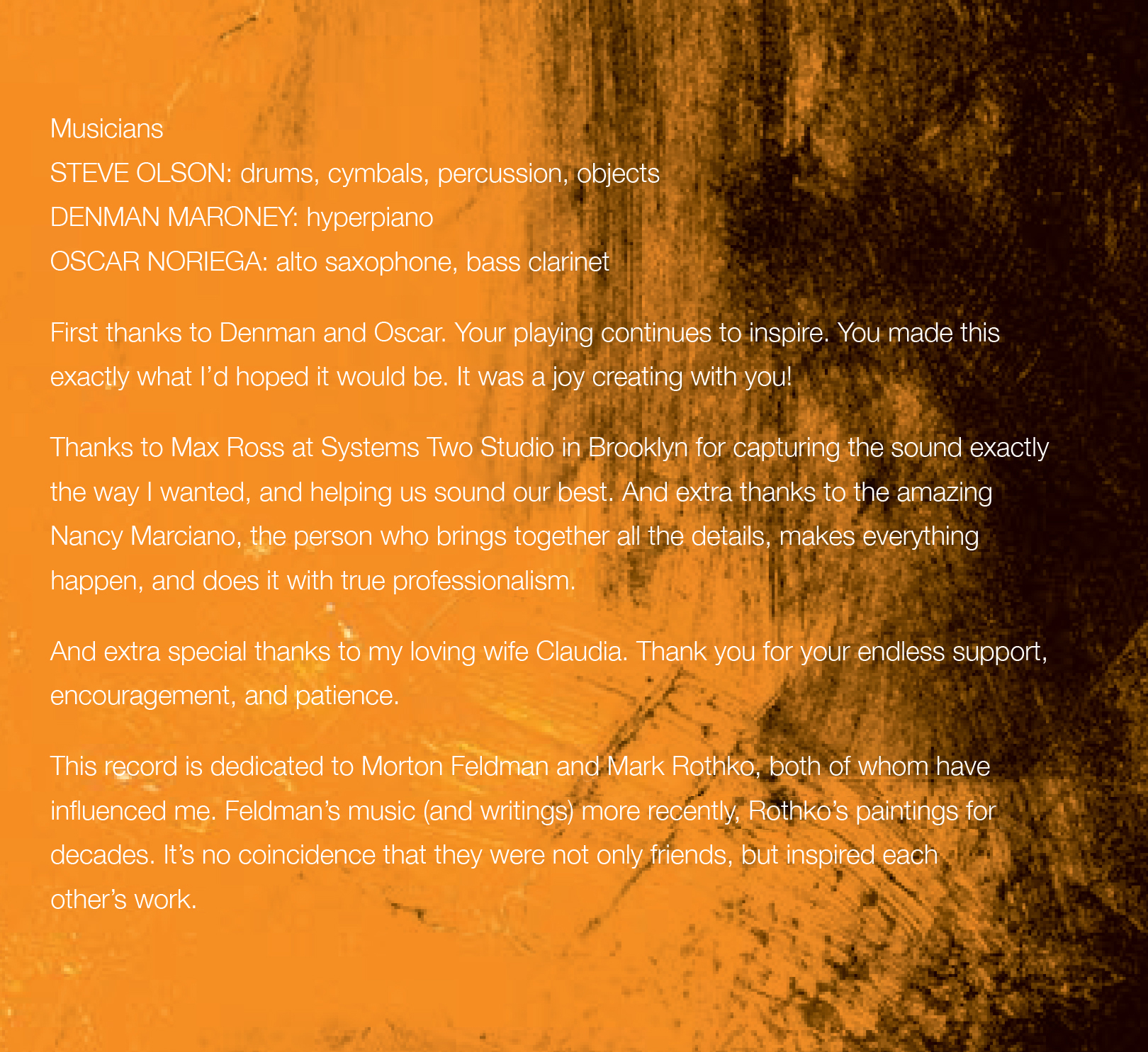
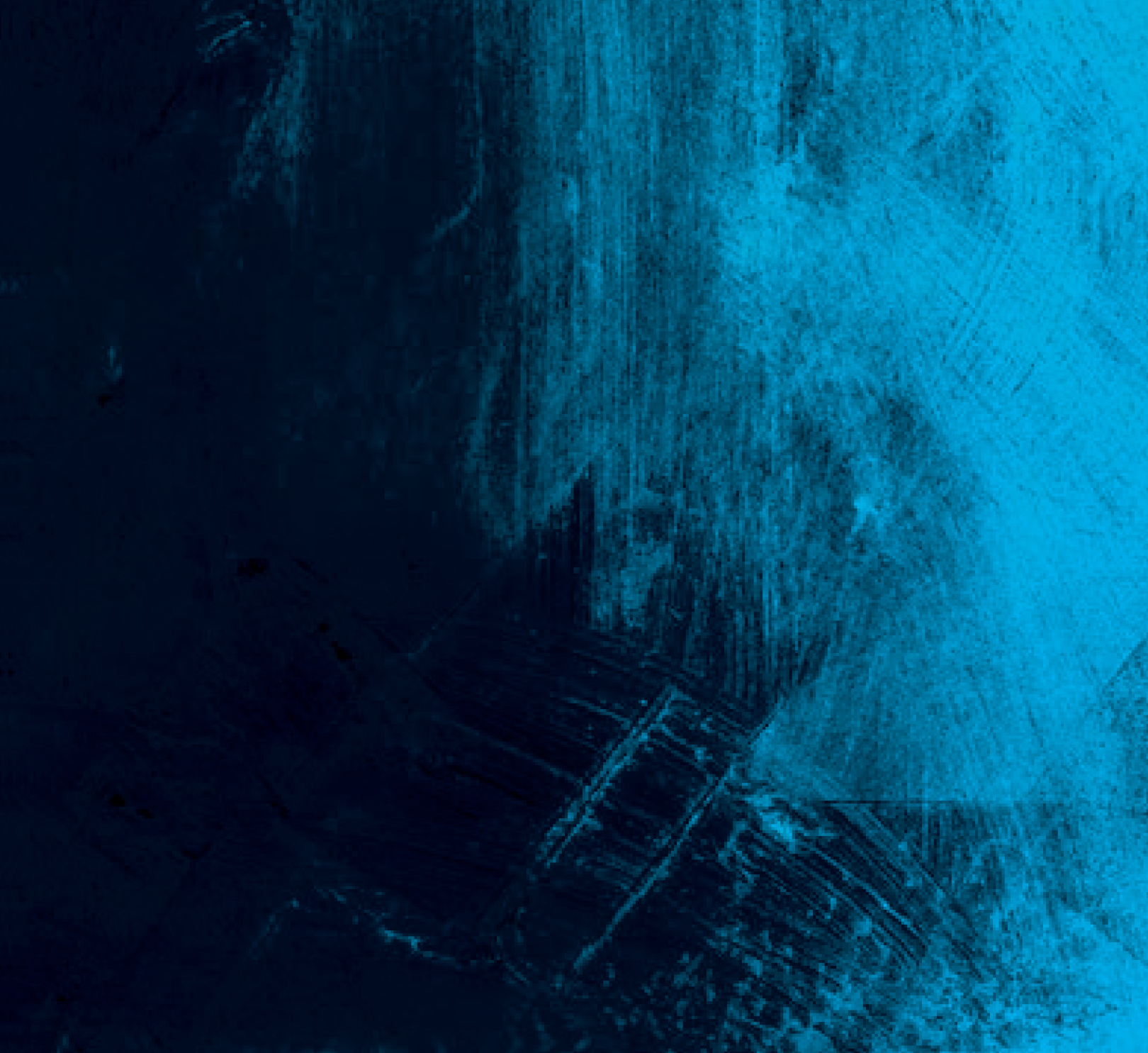
Luckily, I found a wealth of Rothko-inspired artwork that did fit our budget. I focused on the word “Ruthless” in the title; that word, to me, was very angry…very hot. Following that lead, I weeded out any works that had muted colors or earth tones. I also focused on pieces that were more shapeless, with space and breathing room, than Rothko’s more grid-oriented work.

I adjusted and pushed the colors to create a palette I felt represented all of the above, and utilized a single piece of art for the additional panels, changing only the color. I again utilized a simple typeface, less as conscious branding, but rather as a nod to the simplicity and effectiveness as those classic Blue Note and, especially ECM, covers.

So. Did we find Rothko, space, art, and music?

“Very much so. The cover depicts openness, possibility, yet also purpose and possible directions. Exactly the same as the music,” concludes Olson.

Now…about that title…

“I stole the phrase from a biography of composer Morton Feldman. The writer used it to describe Feldman’s music. I just loved the turn of phrase, and thought it nicely described both the joy and pain of creating art.”

Jazz cats…they’re a special breed.